Preserving the recognizable part
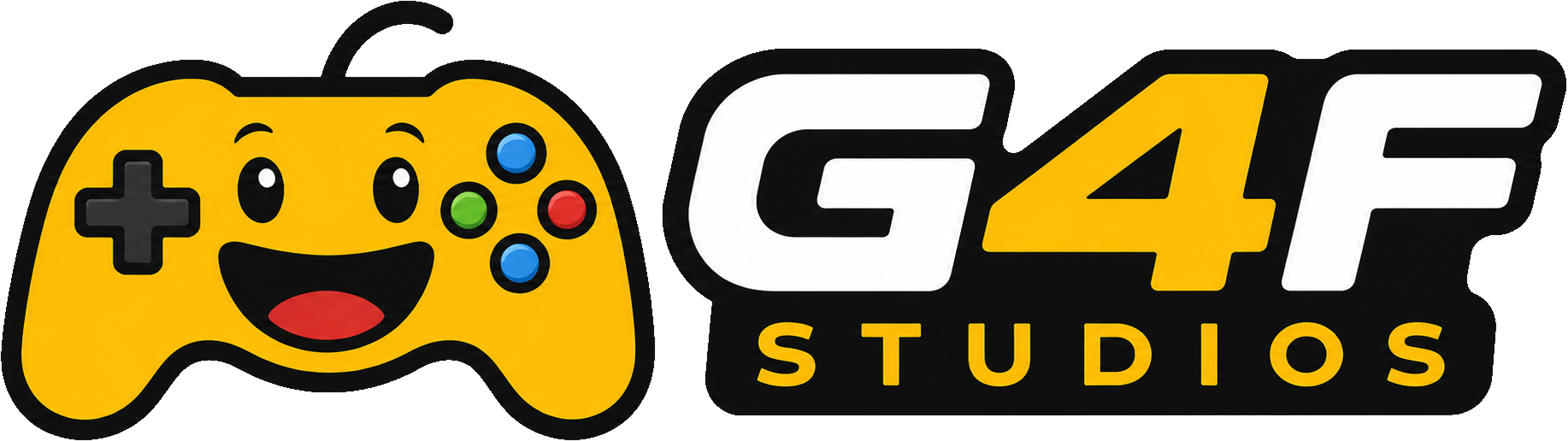
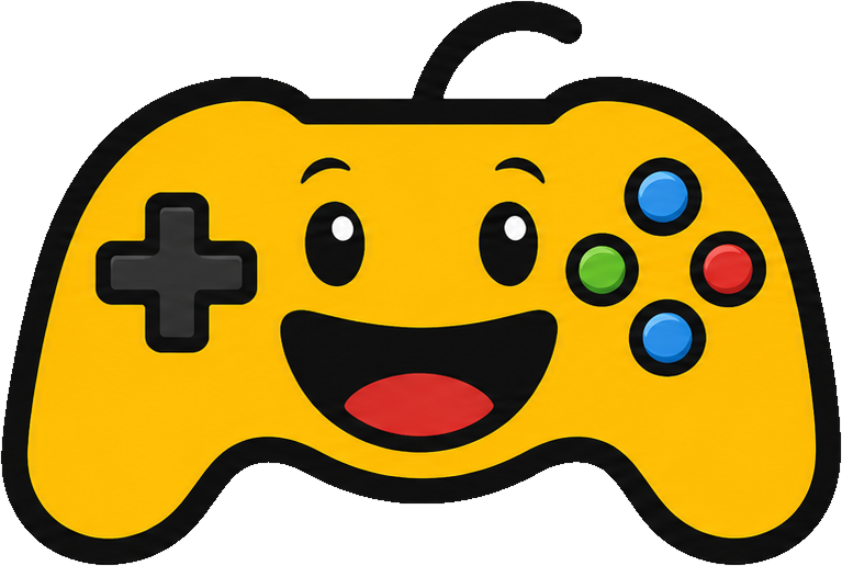
The yellow controller remains the foundation because it carries the approachable personality people already associate with Games4Fun. The goal was not to replace it with a generic entertainment symbol.
The illustration was simplified, cleaned, and integrated with a G4F-first wordmark so the mascot and company name feel like one designed system rather than an old icon placed above new text.
Playful without looking temporary
Purple, yellow, black, and white remain the core palette, with red, green, and blue reserved for small controller-button accents. Strong contrast keeps the identity recognizable while cleaner hierarchy moves it away from children’s-channel and esports-clan conventions.
The system supports a publisher header, square mark, game endorsement, website, store presence, press materials, and future products without forcing every game to share the mascot’s illustration style.
A system developers can preserve
The website package now includes design tokens, component specifications, motion rules, content schemas, and localized copy. These assets define what may change and what should remain stable as the site moves into production.